
Design thinking in higher education
The challenge
Introduce UX and service design thinking to a higher education office serving over 10,000 students, staff and faculty with highly sensitive immigration services and information.
OUTCOME
Get stakeholder buy-in across a 40 plus office and established a regular cadence of usability testing, research and design iterations.
My Role
Educate and lead UX thinking, usability testing and product design, manage designers, lead UX workshops and get executive buy-in and funding.
A champion for UX
When I joined NYU Office of Global Services (OGS), the connections between printed materials, the web site, in-person services, online workshops, required legal forms and social media were unclear and unarticulated. We had a dedicated staff of immigration counselors on hand to listen to some of the most pressing and dire legal situations but there was little thought to the user experience as a whole. As is typical in large institutions, decision making was gridlocked by committees and a lack of actionable information.
Fortunately, OGS leadership was passionate and open to transforming their services with design thinking. With their partnership, I introduced user centered and service design thinking to the complex ecosystem of services provided by the dedicated staff of advisors and administrators in a high-demand student services office. I was able to improve the services and communication offered to NYU's international community through usability research, stakeholder buy-in, collaborative teamwork and holistic design.
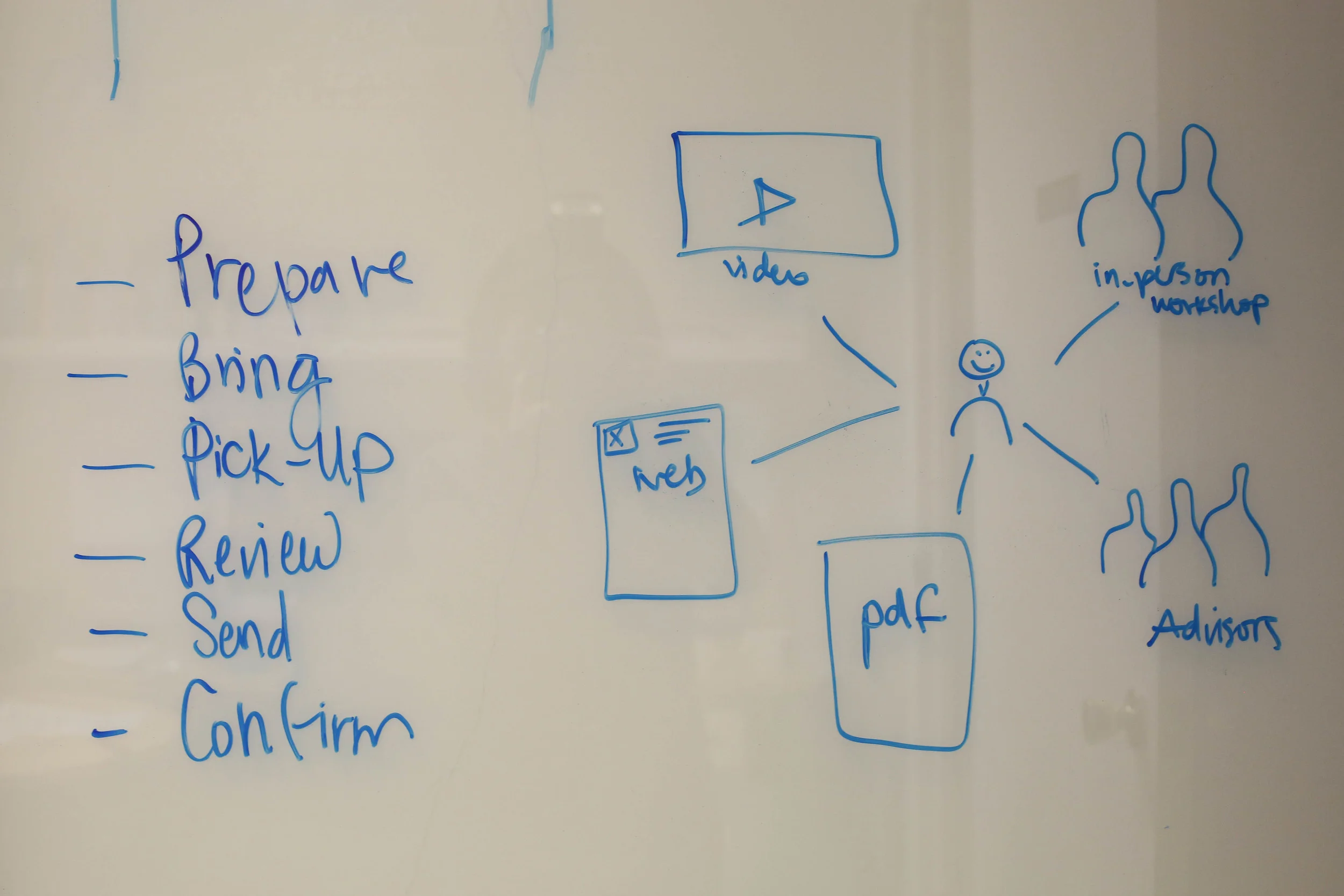
Early ecosystem sketches
Brainstorming user journeys
Mapping the ecosystem and user journeys
There were a number of service and digital design challenges at OGS. The office provided very timely, sensitive immigration information and services to the largest international community in higher education. I worked with Benji to map out user journeys throughout a students' educational experience and provide a connected immigration services experience. We identified gaps in the journey, inconsistencies in instructions, copy and requirements, and tried to address any pain points with a user centered approach that put the student's perspective firmly in the center of any changes and decisions.
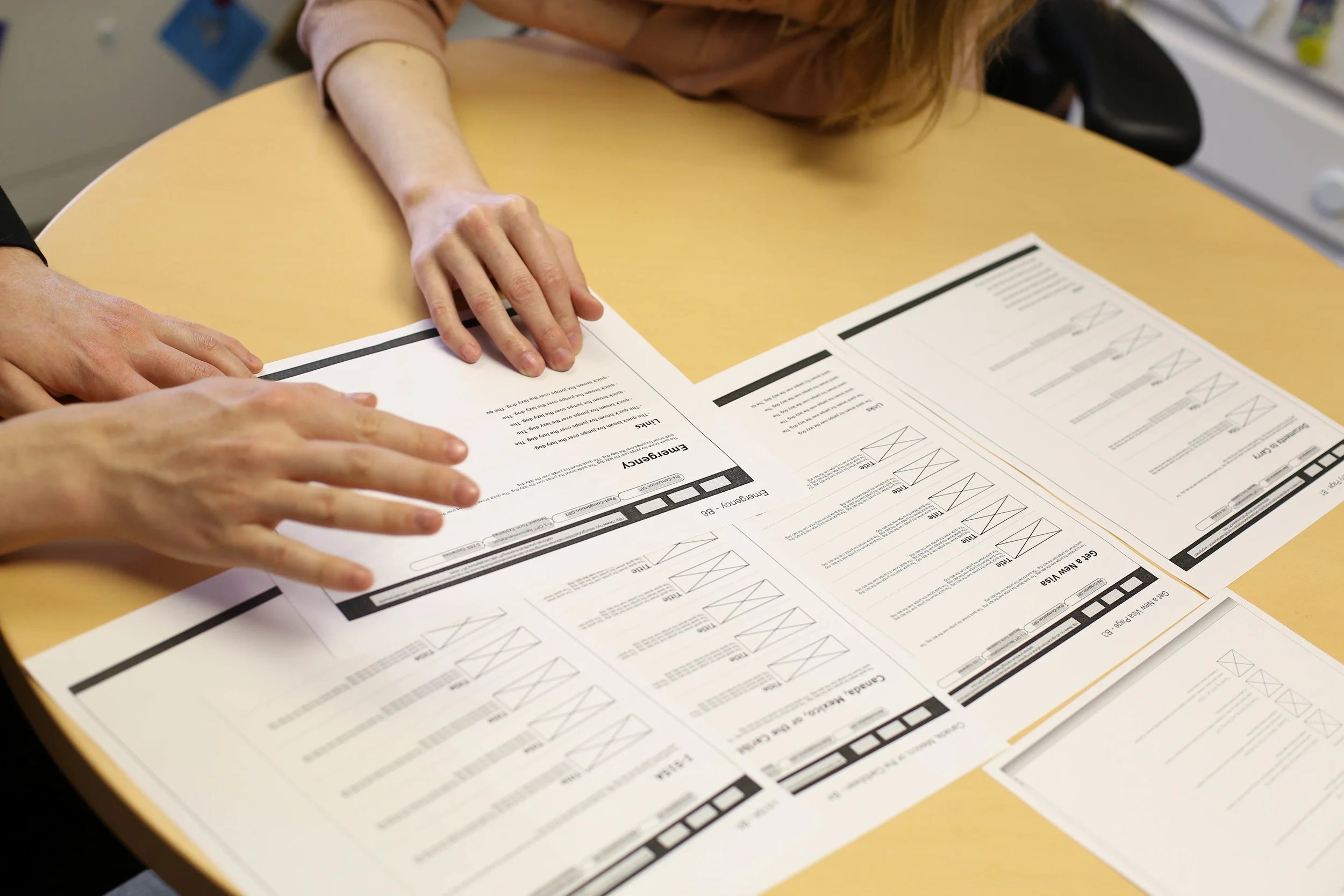
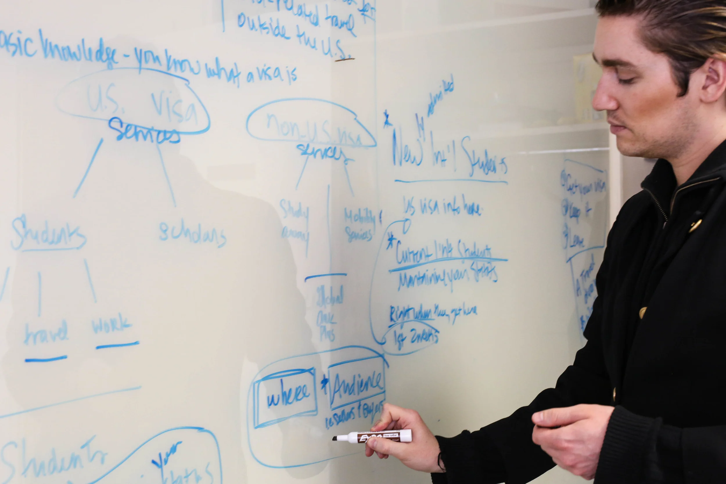
Reviewing wireframes with staff
Designing for physical spaces
One of the major pain points for students was the wait process of seeing an advisor. The waiting room was cramped; there was no good system in place for signing up to see an advisor and getting notified. Sometimes, students would wait for hours in standing room only conditions for emergency immigration situations because they had come at a busy time. There was no visibility into the best times to come for the shortest waits and no way of notifying students should they want to leave the premises.
The office contracted a third party vendor, Qnomy, to implement a queue management kiosk. Benji and I teamed up to design the kiosk experience with user testing and design iterations. Read more about the case study.
Creating user-friendly immigration content
In addition to these larger service challenges, I worked to convey important legal and immigration information in more user friendly ways and collaborated closely with advisors who lent their immigration expertise to site copy.
It was key to have stakeholder buy-in as the student advisors were the chief architects for site copy and in-person service. Through regular participation in usability testing, they got to witness firsthand the difficulties students were having understanding the legal jargon and cumbersome navigation on the site. We used affinity mapping to identify and prioritize the biggest problems that needed to be fixed.
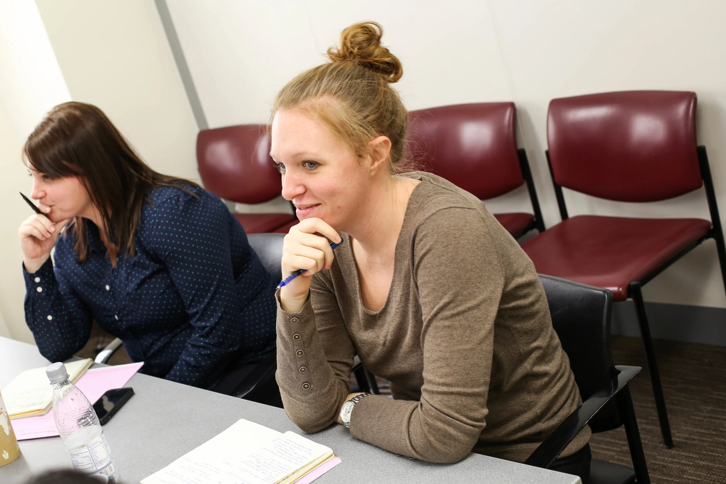
Staff member observing usability testing.
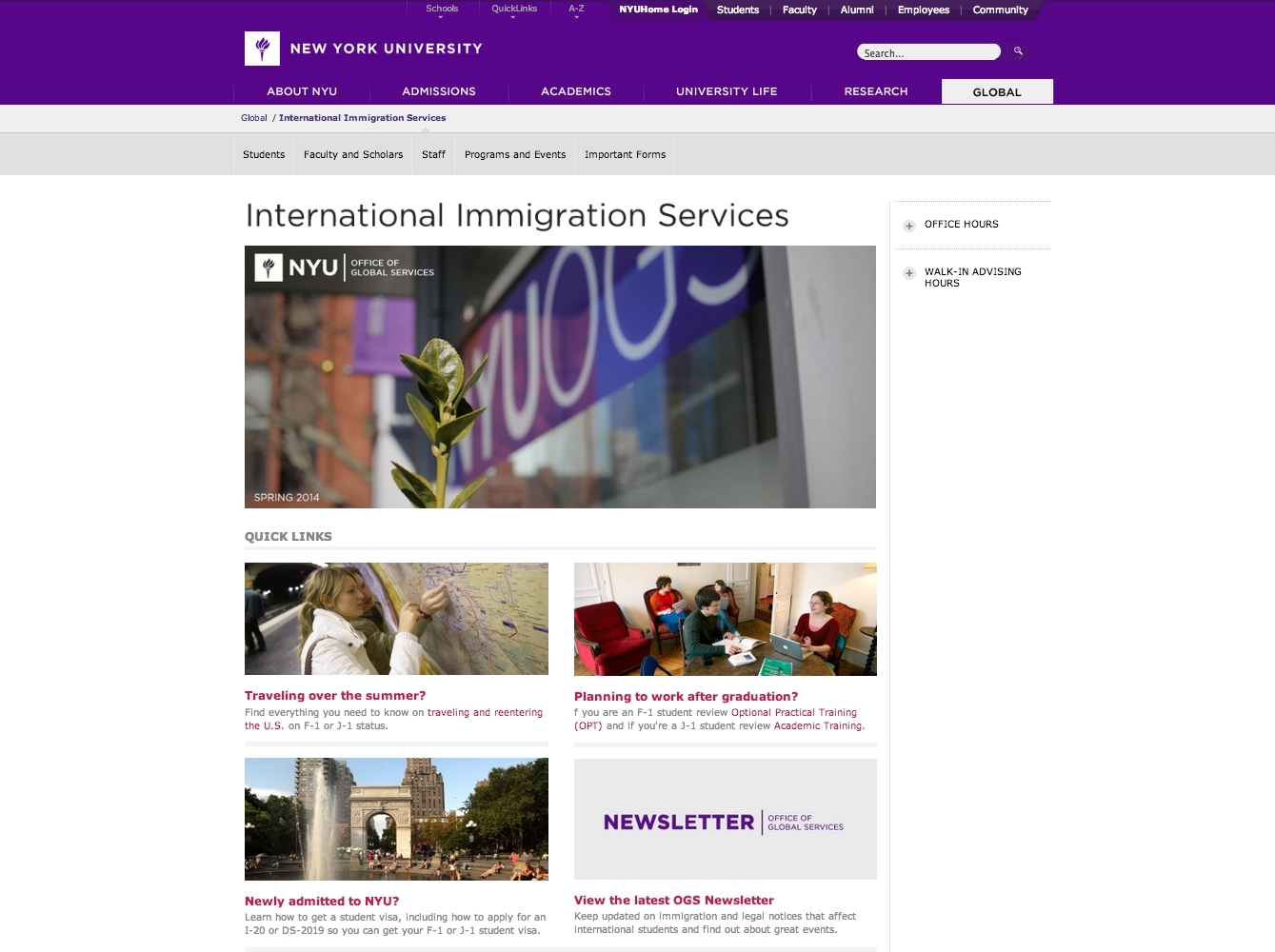
Is your homepage broken?
Every month, we tested different sections of the site using a sprint-based editorial calendar and iterated our designs. The site had a number of factors working against it: very long urls, CMS constraints, NYU's overall information architecture, in addition to the sheer amount and diversity of critical content that OGS needed to provide the international community. Through consistent effort, we were able to drastically change the look and feel of the site through design, copy changes and information architecture site strategy.
One of the biggest discoveries upon starting usability testing was that every user (yes, 100% of users) thought the site was broken(!) Below on the left is the original homepage. It had a flash animated graphic that mimicked the rotating bars of a train station departure board. Because of the slow loading times and the disconnect between the graphic and content, users thought the site was broken. This was the first the staff had ever heard this feedback. This graphic had been up on the site for over a year.
We listened to our users' wishes for less content and more visuals and implemented the changes on the right. No more broken looking site. I loved seeing students in usability testing breathe a sigh of relief once they saw the new design and could find what they were looking for more easily.

Homepage: Before
Homepage: After
Redesigning the site architecture
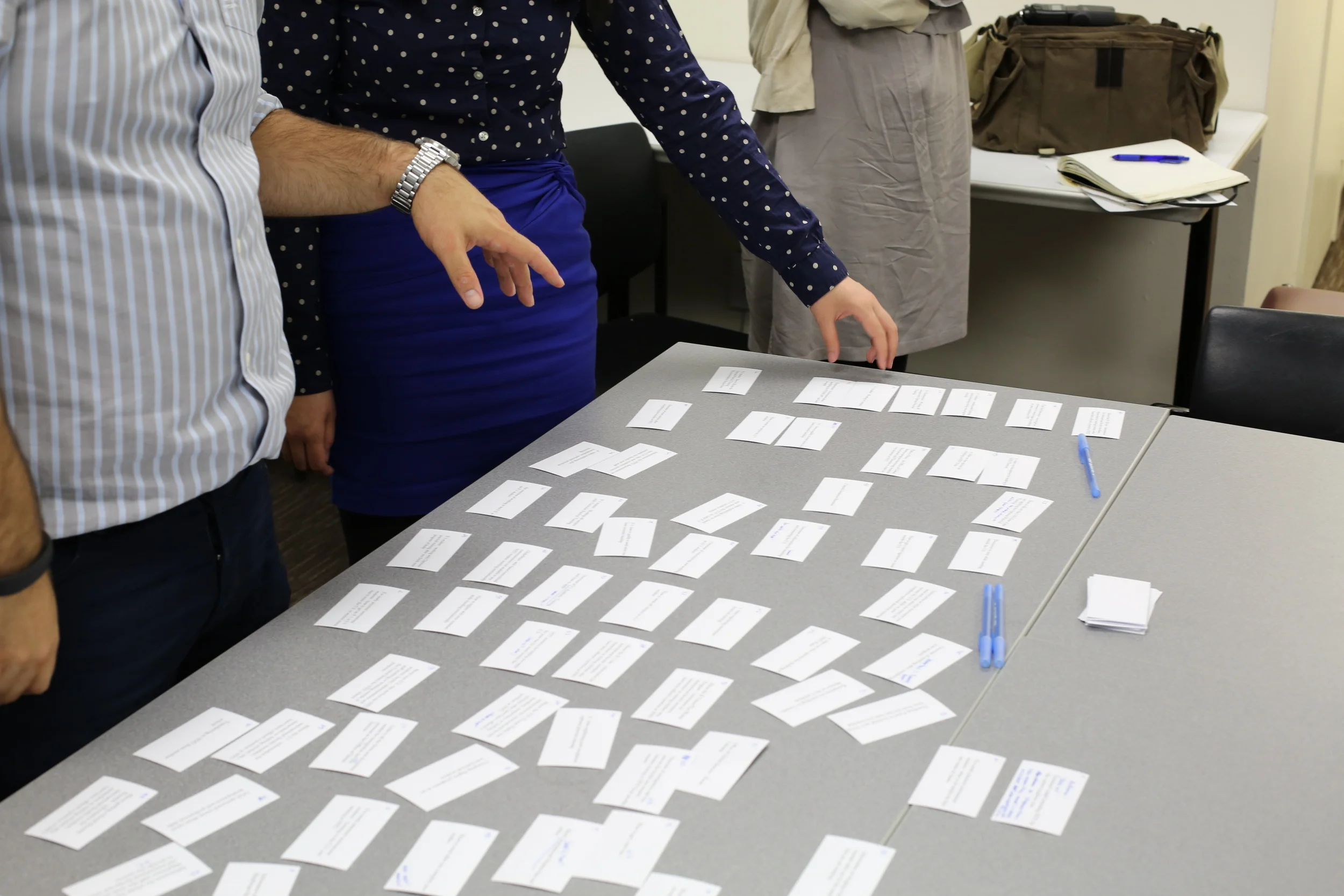
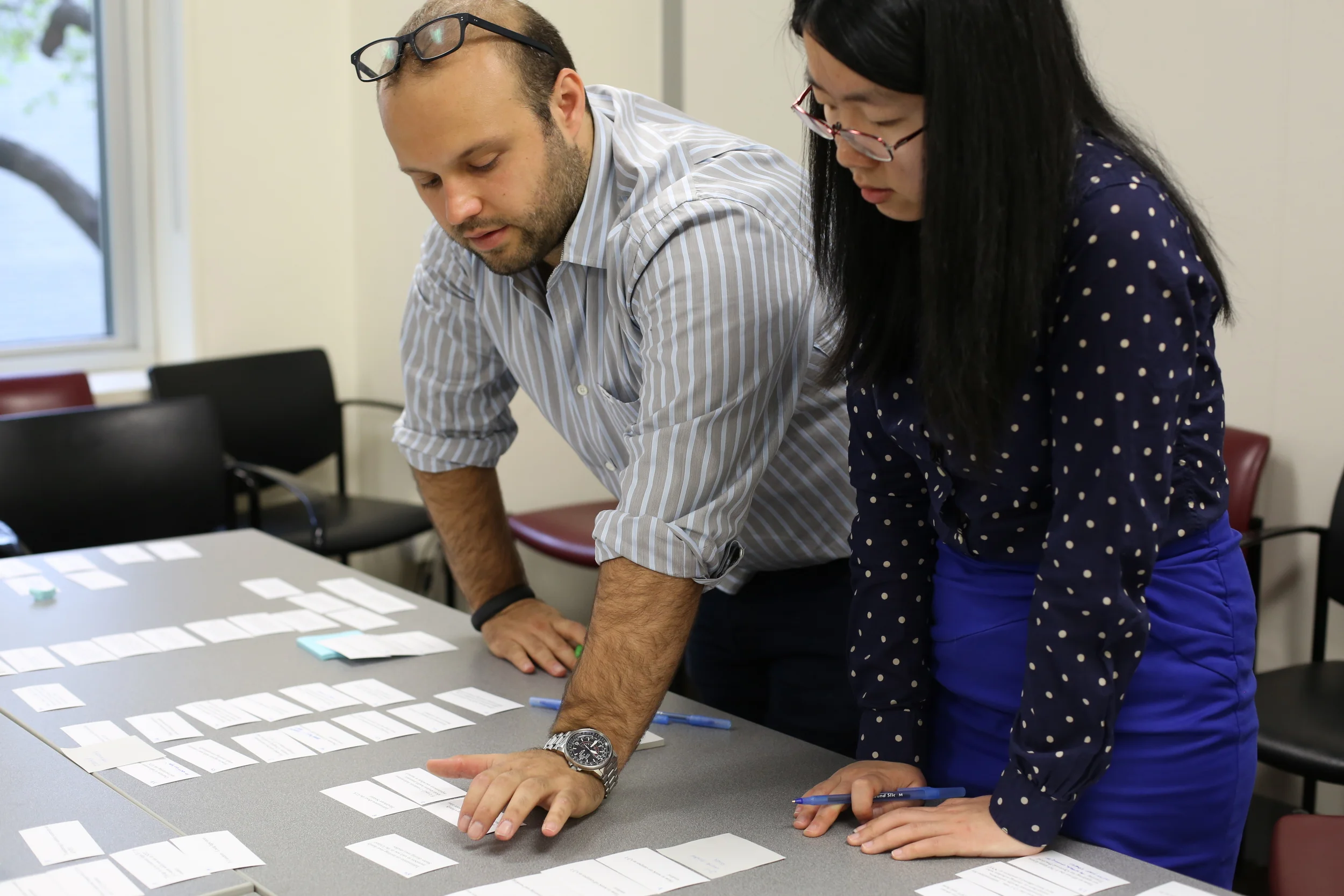
After months of usability testing and design iterations, it became totally clear that at the heart of the site's problems was the amount of content that students had to navigate. The content was just too deep and too difficult to find.

I embarked on a site architecture redesign project with card sorting research. I conducted open and closed card sorting tests with groups of students and synthesized the results, making recommendations for future improvements. The changes were implemented after I left the position.
Retrospective
In retrospect, my time at NYU OGS was very rich and fruitful. I was able to get key stakeholder buy-in through user research which led to collaborations that ultimately improved what is understandably a stressful service and topic for many people. It showed me the importance of stakeholder buy-in to the success of any project and allowed me to do both research and design for a number of different projects.
Impact
- Designed for physical and digital spaces
- Educated a staff of 40 people on user centered design
- Set up a successful design process that continues to this day
- Got stakeholder buy-in through usability research and an internal blog
- Incorporated monthly usability testing
- Made systematic design iterations to the site
- Changed copy to be less dense and friendlier in tone
- Improved user reactions to the site (reactions changed from "confusing" and "boring" to "informative" and "clear")
- Identified redundancy and helped reduce the amount of ineffective requirements
- Mentored designers in user experience