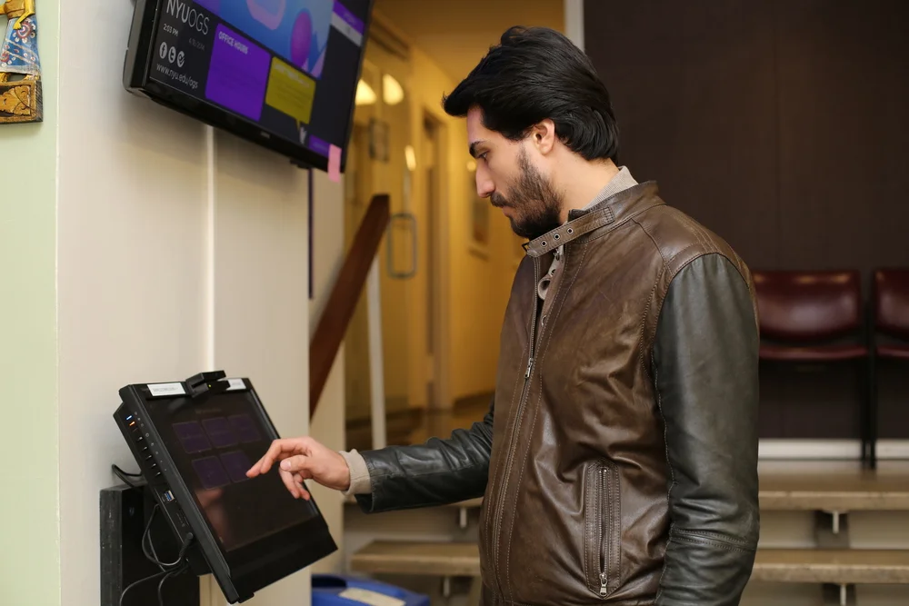
A pioneer queue management kiosk for NYU Global
The Qnomy Kiosk for NYU's Office of Global Services (OGS) is the pioneer queue management kiosk for NYU Global. The touchscreen kiosk directs and manages wait time for thousands of students who come to OGS to meet with an advisor and seek other services. The kiosk design features a simple graphical interface inspired by New York City's MTA kiosk and allows students to receive text notifications once they have entered their information. A main screen in the waiting room displays queue order, average wait time, YouTube video workshops, live Tweets and updates.
Role UX Design, Usability Research Lead
Team Benji Canning-Pereira, Hanna Kang-Brown
Technology Qnomy, Photoshop

Context
NYU's Office of Global Services (OGS) provides time-sensitive immigration and counseling services to thousands of international students, faculty and staff.
Problem
The office is situated in a former lobby of an apartment building and not optimal for hosting hundreds of students waiting to see a counselor. The staff struggled to manage the thousands of students who needed to see an advisor and provide a comfortable space to wait in a cramped lobby area. Students had no sense of how long the wait would be and would have to stand if there was no sitting room. Sometimes, students waited as long as an hour and a half or left in frustration when too much time had passed. Internal staff management also had no visibility into the demand for specialized counseling assistance and struggled to distribute staff resources appropriately.

Goal
Our goal was to use the Qnomy system and design an easy-to-use kiosk interface and display experience that would address the problems.
We aimed to do the following:
1) Provide students with wait time estimates and text messaging service
2) Alleviate wait room crowding
3) Collect data on reason for student's visit for internal resource management and planning
4) Use the wall-mounted display to show number in line, educational workshops and events and emphasize OGS's social media presence and outreach programs.
process

A staff committee had been working for months to chart out the information architecture and discuss requirements with the Qnomy vendor. Fellow designer Benji Canning-Pereira and I were brought on a couple months before the launch to design the interface. I proposed running usability research and iterating on the kiosk and display experience before and after the launch.
Additionally, we were tasked with designing a lobby display that would showcase wait times as well as dynamic content. Our brainstorm and concept development sessions led us to emphasize social media on the big screen display as well as educational presentations for more engagement with students waiting for their appointment in the lobby.
Usability Testing


The staff at OGS were eager to make the kiosk experience a great one but they were not familiar with user experience design or research techniques. In order to familiarize and introduce usability techniques, I first had staff sign up for 15 minute slots to test the kiosk themselves and give us feedback. I then put together a usability testing plan and recruited international students to test and complete tasks while staff watched in an observation room and took notes.
synthesis & iterations

At the end of usability testing, I led the debrief and synthesizing session to come up with a prioritized list of recommendations and changes to make for the next iteration of designs. We learned that students didn't know what to do first when they approached the kiosk. They had a hard time figuring out how to swipe their card and had a difficult time answering the initial questions. I worked with the staff to correct the information architecture, change the wording to make more sense for users, and add a more obvious and engaging start screen.
outcomes

This project was successful for a number of reasons. First, it met its goal of easing the frustrations of both the students and the staff. Students had a better sense of their number in line and could sign up to receive text message alerts five minutes before their appointment. This allowed them to leave the building with peace of mind and come back in time. In turn, staff had a clearer sense of who was coming to office and with what needs. The interface was clear and easy to use. The display screen was informative and timely.
Secondly, it introduced design thinking and user-centered design to the Office of Global Services. This project made such an impression that it led to a major shift in design thinking at the Office of Global Services and the adoption of usability testing research on a monthly basis for all digital products and services.
Lastly, the success of this pilot project led to NYU adopting the Qnomy queue management system campus wide for other offices and departments.